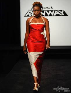
This week the designers are scared shitless by.....kids.
They have $50 and one day to make a fashionable outfit for a girl aged 6-9 years old. Of course, there's a twist, and this one is they get one extra day, but they need to make another garment to compliment the children's look for their model to wear. Off to Mood with $100 and can I just say, this season is so much more interesting than last season! Even Mood is more entertaining. A random dog runs by and Jay wears short shorts.
This episode is a clear homage to Janeane and her tears. Are you trying to tell us something Lifetime?
After the girls gravitate toward Anthony and run around driving everyone crazy, it's off to the runway!
Maya's kid look is fine, nothing exciting, maybe a bit too young for a girl this age. I do not like the model's look. The pants scare me. I like that she made pants, but why is there that weird tie thing on there and a zipper? And what mom is going to wear something showing her mid-drift?
Emilio's kid look on it's own is terrible, and with the model "mom" look, well, it's pink. It's so country club trophy wife in that pink color. I guess he felt stuck using pink, because of the kid's look. I think the design of this would show through more in a richer color.
I will say this about Mila: you know which one are her designs as soon as they walk down the runway. The children look is fine, but I am just not into the model's look. I think that the judges are going to be sick of her color blocking really soon.
Ben's looks are safe. Nothing much to say here, except that he hasn't seen children's clothing in a while.
I like Anthony's child look, very cute. I think the model "mom" look is blah. Why is it a top and a bottom and not one dress? And if he had the need to do seperates, why not different colors? I don't know, something is missing there.
The judges' Tops:
Jesse did a beautiful red wool coat with a matching gray red dress. His two looks went together the best. A definite top 3
Is that the same black belt from Ben's cover look last week? Using that Bluefly accessory wall thoughtfully are we?
Jay's looks were fun and chic. I love the kid look here, the colors are great and the pockets are very fun-ctional. I'm not completely sold on the model's look. She does look pretty fresh, but the skin peeking out between the top and bottom is not something I enjoy.
Seth Aaron's looks have arrived. What's that? It's Gwen Stefani on the phone and she wants to buy this right NOW. God that jacket is hot. When I saw that jacket, I just knew he had to be the winner. The kids look is the best designed as well; he is the only one that really understood what little girls would want to wear. How cute was that hoodie? Nailed it. Win!
The judges' Bottoms:
Is this what Jonathan meant when he said "unleash the crazy"? Eek, put it back, put it back! I didn't hate this when it first came out, but the more and more it stood on the runway, it was like a train wreck. The children look is really bad. Just, why? Do kids scare him this much? And, like Michael, I see where he was going with the model look, he just didn't make it to the station. None of these fabrics work here.
Amy's looks are a bold statement. The child look here is actually what a girl would wear: lots of layers. I like the skirt, and the sweater is fun. The tucked in shirt and leggings don't quite work, but she's on the right track. And how cute was her little model? She was so trusting of Amy. The model's look is out there. Again, she was on the right track, it just didn't get executed properly. This reminds me of Kit's avant garde look, the hoop skirt that looked like a quilt; good idea, just didn't quite make it. I really thought the pants were a skirt, and in that sense they weren't bad. It seems like she started out with the petal idea and the petals became a bigger thing than the look itself, and it almost got her kicked off.
P.S.: Blue and Orange do go together, they're complimentary colors, so says the color wheel.
Oh Janeane. When we first saw you cry on episode 1, mere minutes after being on the show, we knew you weren't going to last long.
As far as these looks go, they're not super bad. Yes, they got called "mall looks on the discount rack", but look at the top on the model-it's totally cute. Ok, the pants and jacket aren't great, and that coral color is kind of irritating....but the child's look is kind of "whimsy" as the judges were so obsessed with wanting. It's certainly more whimsy than some of the other girly girl looks a few of the other designers did. Alas, it was a week when normally this may have been safe, but everyone else did pretty good this week. So, it has now become your time.
Oh, and Michael, don't tell me how much a child's outfit cost, but guess what, it's not $10.
Janeane, we're sorry, but you're Out. I hope you get some confidence and maybe some training, because you do have a youthful point of view. Remember girl, you finally got to make that red romper that you were so jealous of as a kid.
Saturday, February 20, 2010
Wednesday, February 17, 2010
Run For Cover
This week the designers had the "unprecedented" (since last week or last season, Tim?) challenge of designing for a celebrity! Finally the designers get to design for Heidi Samuel nee Klum. I have suggested they design for her! And, to sell more editions of Marie Clare, they are designing an outfit for a Spring issue that Heidi will wear on the cover of "marryclaire magazeen"!
So, designing for Heidi, check.
Designing something with color, check.
Be careful of prints and make the action happen up top, where it will be seen, check.
Make it a Spring look, check.
Not much to say about the design room except, wow, Mila is becoming this season's Irina.
On to the Runway!
Oh dear, here's Maya's look. It's sewn very badly, the colors are too washed out for a cover and I'm not feeling the prominent V action in the front. Wow, just bad all around. I guess it was Spring enough and they liked that bib collar enough to save her from the bottom 3.
Jonathan was so proud of his look, as usual. I actually am kind of feeling this look. It's got that 70's vibe, in a good way. It's something a little different, it just doesn't quite work for this challenge. And I'm not sure I can see Heidi in it.
Jay loved the way this moved on the runway and so did I. I liked the print too, it had faint stripes. He's close....there's action up top. But the pale color and bridal style just doesn't work either.
Amy is fresh off the last win and has immunity. She went with a print, which they said you should avoid....and I'm not sure about the doo-dad on the chest area. Yeah, there's something going on up top, but it is needed for this look?
Jesse designed a very Heidi look this week. I could definitely see her in this, and he used color, which for some reason most of the other designers shied away from, when it was mentioned in the instructions for the challenge. Did Mood hide all the colored fabric? Jesse's look could have been in the top 3.
Seth Aaron makes another rockin' look. This is a fun one, and how in the hell does he make these looks in 1 day??? However the color is not so much Spring and maybe too much coverage for our Heidi.
The top 3 looks this week:
I have no idea why this look by Emilio made it to the top 3, I think. The judges didn't like the string things hanging off the dress (agreed!). I also didn't like how ice skater style this was. It was chosen as top 3, I think, but they literally had Emilio alter his dress on the runway! That was new for sure..... I don't think Heidi would fit into the top of the dress....just saying...
I'm convinced this dress was chosen because it's red and Heidi wears a lot of red.
Ben comes out of his shell and creates this eye popping look. This says color, design up top and Spring. As for Heidi wearing it, well I'm not sure. The problem I had with this look, was that the belt was a big part of the look, and I don't think he made it. I could be wrong! Very close second this week.
Anthony FTW! This Alabama beauty queen nails the challenge with a blue look that's Heidi length to boot. Great color and well sewn. Congrats to Anthony!
The judges bottom 3 looks:
Mila probably thought she was on the runway for a winning look, but she thought wrong! Her model is dressed in a drab look. Mila thought it was more of a peach color. Michael Kors rolls his eyes and calls the top a jog bra. Ouch! Her model has a Mila type haircut and stance, but it's just not flossing with the judges....must be that prominent V thing....
Janeane was trying to evoke the ocean waves with her look....but the judges heard an empty shell. Poor Janeane is on very thin ice on this show and really needs to step up her game if she's gonna last much longer. This look is heavy, white and so not Heidi it's not even funny. Janeane is saved for one more week.
Anna, oh Anna. I kind of thought you were Janeane this whole time, but found out this week that Janeane is someone else. Anna, I didn't get to know you much, and you're going out on a shorts look. Kudos for going with something besides a dress! And there was kind of a Spring-ish color going on there....
This look is even less Heidi and why oh why would you even think of doing pin-striped black short shorts with a pale blue tank and a vest? This is a confused look and sadly, Anna is out.
So look for Anthony's look on Ms. Samuel soon in Marie Clare!
Tuesday, February 9, 2010
Design Your Heart Out
This week's challenge is for the Signature Campbell Soup "Address your heart" campaign gala event. The dresses must be prominently red and the Campbell branding must be present. The wrench in the works is that they have to design for "real women" who have been impacted by heart disease, not their stick figure models.
At Mood they are given $100 and plenty of "Campbell soup red" fabrics. The designers also get to use some Campbell soup prints if they'd like.
This week, I noticed those cwazy designers are already losing their minds after 3 challenges!
Jesse: "I want to get out of the bottom area" Sure you do honey....
Mila and Maya
The twins with bangs. Watch out Maya, Mila is not your friend. Just because you both rock dark hair with bangs does not make you buddies on a reality competition show. But I'm sure neither of you are there "to make friends" right?
Wait? Woah! Li'l Rascals!?!?!!? Seth Aaron, Ben and Anthony rock their suspenders and bow ties. How freakin cute were they all together?
Of course, those evil producers place a random bucket of water that only crybaby Janeane would put her dress by and get her fabric soaked. What the heck is going on?
In the workroom.... it's full of tears and emotions as the women tell the designers their stories. This just in, the designers find out there are other things in the world to care about besides fashion and themselves! Gasp!!!
You would think after the great bonding moments, some amazing looks would come out of it.......
According to Seth Aaron, they can make size 4 garments in their sleep, but to make a larger size for some reason is very very tricky. Obviously, there would be design elements you would want to avoid, and you do have to take in mind some curves and support for the bosoms, but why do the designers in these challenges always want to do drapy loose clothing items to hide the curves? I'm glad they do these challenges; you shouldn't be able to win if you aren't able to design for bigger than a size 4, it's too unrealistic and that needs to stop.
On to zee runway.....
I liked Jonathan's look, it looked like a gala look would and it was definitely red, although maybe it wasn't "Campbell soup red". Perhaps there was some bunching in the middle of the dress, but a one day look for a gala, I thought this fit well.
Seth Aaron was almost convinced to do a drapy Grecian look, which was seemingly going to be a well made draped look, but Tim talked him out of it in the workroom, because it didn't look "Seth Aaron" enough. I have to say, he made a very well-fitted look at the last moment!
Emilio's look was OK. I felt like it was a pass, but not that interesting. And was the gal pregnant? If so, then this is very cute, but if she's not......
Janeane actually ended up with a good look. It's the right cut and fit for her model and it does have the branding and coloring. A fair pass for this challenge. I think the bottom layer should have come up a little higher to be closer to the top layer. I'm also not sure why so many designers used shiny fabric that barely works on a model, let alone "real people".
Anthony's look was a little more hip hop, a little more rock n' roll. I do like that he did fitted instead of drapy for his look. I think the skirt should be knee length to be age appropriate. All in all, a cute and fresh look that made it to the next round.
Ben was designing for Wonder Woman this week. (I kid!) That's the first thing I thought of when she walked out, I was looking for her lasso. Listen, this dress isn't bad....but it doesn't seem to be fitting her right. With a better fit, and not such a weird belt thing going around the middle, this could have been the top 3.
Speaking of Top 3, why wasn't this look by Jay up there? The top is heart shaped and done very cute! I loved the overall look and it seems to be well made. Too safe perhaps?
The judges' Tops:
Once again, the judges are drinking Mila's Kool-Aid and once again, I just don't get it. This looks like a flag. I do like the concept of it, but it just looks costumey to me! I think the top star works, but maybe if the bottom one wasn't so large, or they were a few little stars wrapped around the dress? I don't know I guess the judges just want something different, but it just seems gimmicky to me.
Mila's mini-me Maya makes it to the top 3 on stage. (tongue twister, non?) At first I just thought, snake wrapped around the dress(?), but the judges loved how the heart shape looked, without being obvious. It is intriguing and different, and I like that they are going for something a little different. (I still miss Ping though!)
Our Bay-Area girl Amy is the winner!!! It does look more drab as a still....but it did move very gracefully on the runway. The top was also done very well and it seemed to work for her body type while also being very gala! Congrats Amy!
The judges' Bottoms:
Jesse didn't get his wish and karma brings him back to the bottom, even without Ping. With the jacket on, this does look very majorette. Otherwise, I thought it looked kind of cute. The judges did not go for this because of the white jacket hitting her right there and how he used the logoing on the design (the pinwheel thing on her jacket). I didn't think this should be bottom 3, except to get back at Jesse for being so mean to Ping. ;)
Yikes and Yikes. When this look came out I was so confused and yeah, confused. Why the hell did she use flesh colored fabric and make this weird Tinkerbell style dress!?! Oh why did she do this to this woman who has been through so much already! The bottom was also uneven and it was just not flattering at all.
Jesus. Oh, Jesus. To quote Michael Kors, "Where do I start?" He gets this petite woman, and he could have done so much for her and he ends up making her look like a Park Avenue hooker. That makeup job makes her look so desperate and yes, those pearls are sewn into the dress as the straps, to make it "more classy". The judges were right, there was a lot of elements going on and the class factor with Jesus is very questionable. I'm sorry Jesus, but you're out.
Auf weidersehen, Jesus.
Man, I'm gonng miss typing Jesus into my blogs. Thanks a lot PR! :(
Jesus "Don't miss with the" Estrada
Subscribe to:
Posts (Atom)